Financial well-being matters.
CoinCraft is a personal finance app designed to help users take control of their financial goals with clarity and confidence.
In today’s fast-paced world, managing finances can feel overwhelming. Whether users are saving for a goal, tracking spending, or exploring budgeting options, CoinCraft offers a streamlined, user-friendly experience to support better financial habits.

Overview
CoinCraft is more than just a budgeting app — it’s a personal financial companion designed to help users manage all aspects of their money with ease.
Our team saw an opportunity to create a tool that simplifies personal finance, empowering users to stay on top of their spending, saving, and financial goals — all in one intuitive platform.
The Audience
Our initial focus was on novice investors, so we designed a dedicated section with beginner-friendly tips and educational content to help them navigate the world of investing.
However, as the project evolved, we recognized a broader opportunity: CoinCraft could serve as a daily financial companion for anyone looking to manage their money more easily — from budgeting and tracking expenses to planning savings goals.
The Opportunity
It all began with a shared experience.
As newcomers to Canada, our team realized how difficult it was to track spending, manage savings, or explore investment options using the financial tools currently available. Most apps were either too complex or lacked features tailored to everyday financial needs.
This gap inspired the creation of CoinCraft — a more intuitive and accessible solution for personal finance management.
My Role
I was responsible for designing the homepage and also contributed to the investment page alongside other team members.
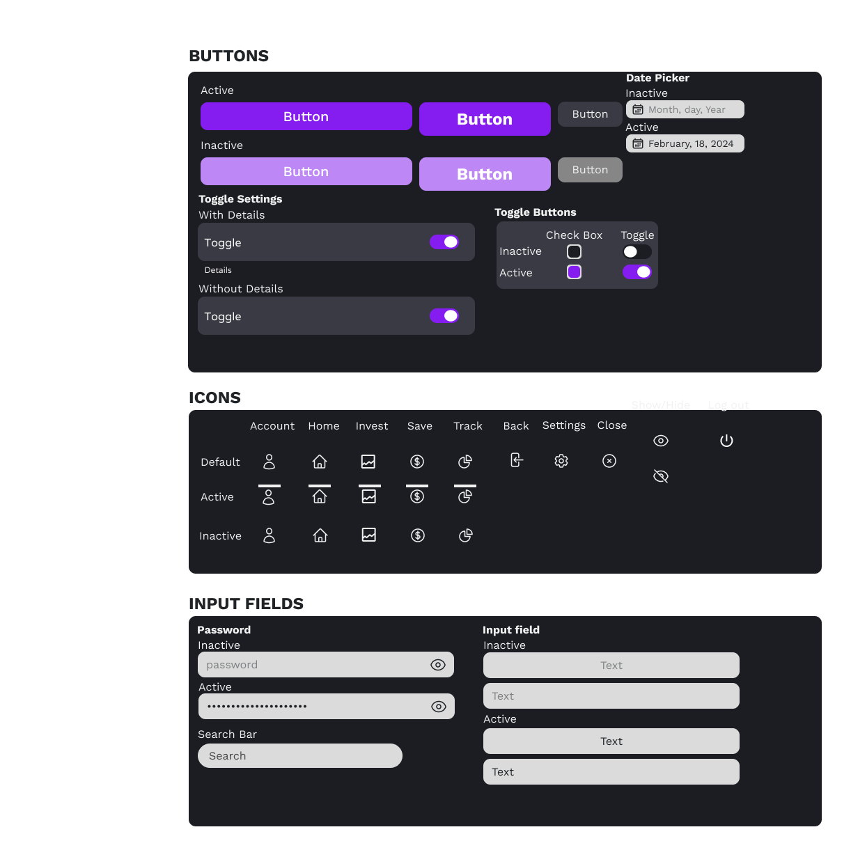
As a team, we collaborated to define the core user flows and determine the number of screens required, with a primary focus on the mobile app experience. Together, we established a design system, including a style guide and shared component library to ensure visual consistency and scalability throughout the product.
Design System
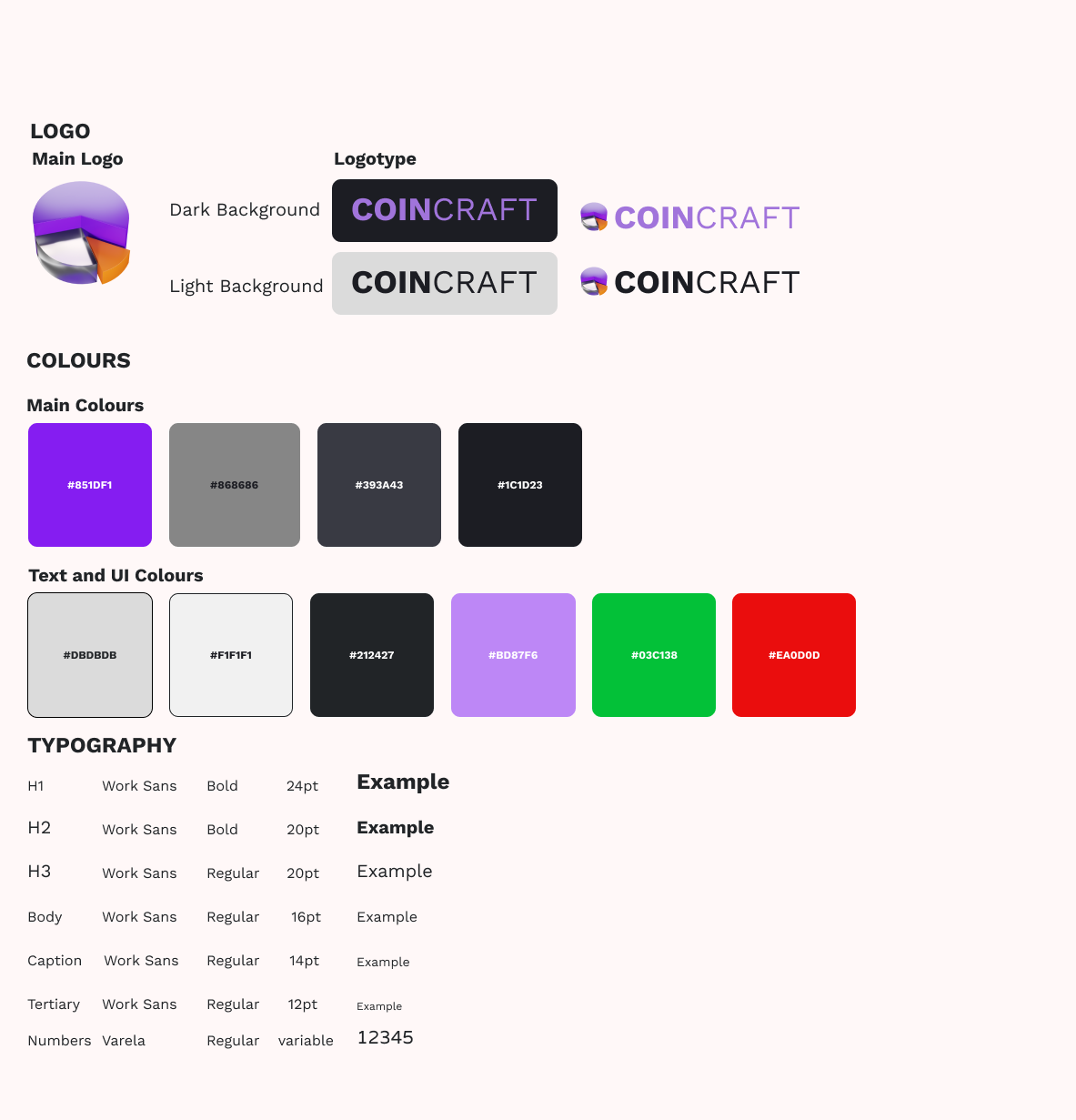
We aimed to create a dark, modern visual theme to convey a sleek and focused user experience. To enhance clarity and engagement, we incorporated 3D icons as visual cues for spending and investment categories, helping users quickly interpret data at a glance.
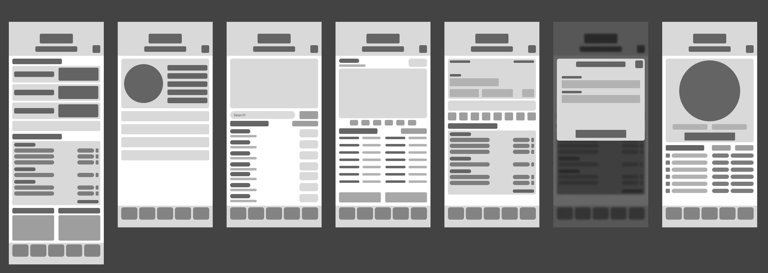
Wireframes
The Final Product.
Full Figma file can be viewed here.

Log-in page.
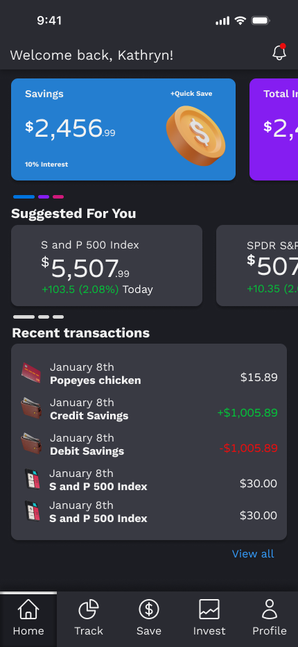
Home page allows users to have a quick glance at their current accounts and top stock picks in form of carrousel.
Recent transactions are also included for ease of tracking.
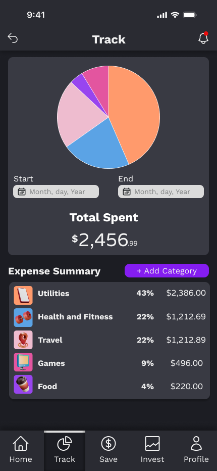
This is where users can get an idea of how much they spent by category, with a pie chart on top for visual representation.
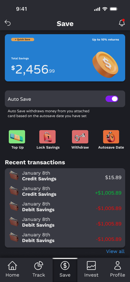
The total savings on this page is displayed clearly on top, with a list below to indicate in red any debit transactions and green for credit.
Users also have an option to toggle on/off automatic withdrawals from attached accounts to the app.

As mentioned, we want to make this app accessible even for novice investors. With that in mind, tips and tricks are displayed on the top in form of carrousel, with the current stock price and its volatility below.
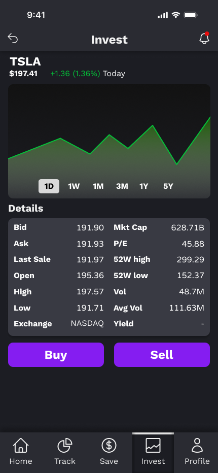
This is the stock detail page, with its core information displayed. Buy/sell orders can also be executed here.
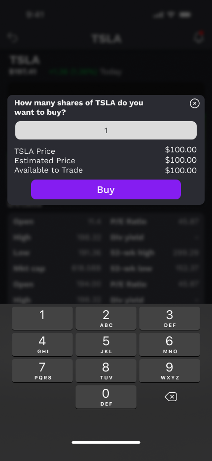
Buy order execution page.

This screen appears when “top up” button is selected.